# 微信小程序-基础加强
目标:
- 自定义小程序组件
- 小程序组件中的 behaviors 的作用
- 安装和配置 vant-weapp 组件库
- MobX 全局数据共享
- 小程序 API 的 Promise 化
目录:
- 自定义组件
- 使用 npm 包
- 全局数据共享
- 分包
# 1. 自定义组件
# 1.1. 组件的创建和引用
创建组件(header)的步骤:
创建
/components/header目录在 header 目录上右击,选择 “新建 Component” 后,输入组件名称 “header”
微信开发者工具会自动创建组件相关文件
proj/
  components/
    header/
      header.js
      header.json
      header.wxml
      header.wxss
引用组件:
- 局部引用:当前页面内有效
- 全局引用:所有页面内有效
局部引用组件:
在
[页面.json].usingComponents中引用组件{ "usingComponents": { "my-header": "/components/header/header" } }在
页面.wxml中使用组件<!--pages/home/home.wxml--> <my-header></my-header>
全局引用组件:
在
[app.json].usingComponents中引用组件{ "usingComponents": { "my-body": "/components/body/body" } }在
页面.wxml中使用组件<!--pages/home/home.wxml--> <my-body></my-body>
组件和页面的区别:
[组件.json]{ // 额外的 component 属性,标记其为 component "component": true }[组件.js]// 使用 Component(), 而非 Page() Component({ // 事件处理函数需要定义在 methods 选项里 methods: {} })
# 1.2. 样式
组件样式隔离:
- 组件 A 的样式 不会影响 组件 C 的样式
- 组件 A 的样式 不会影响 小程序页面的样式
- 小程序页面的样式 不会影响 组件 A 的样式
组件样式隔离注意点:
app.wxss中的 class 选择器对组件 无效app.wxss中的 id 选择器、属性选择器、标签选择器对组件 有效
修改组件的样式隔离选项:
修改位置
// `组件.js` 中修改
Component({
  options: {
    styleIsolation: "apply-shared"
  }
})

// 组件.json` 中修改
{
  "styleIsolation": "apply-shared"
}
可选值:
isolated: 启用样式隔离,在自定义组件内外,使用 class 指定的样式将不会相互影响(一般情况下的默认值)apply-shared: 表示页面 wxss 样式将影响到自定义组件,但自定义组件 wxss 中指定的样式不会影响页面;shared: 表示页面 wxss 样式将影响到自定义组件,自定义组件 wxss 中指定的样式也会影响页面和其他设置了 apply-shared 或 shared 的自定义组件。(这个选项在插件中不可用。)
参考:miniprogram/dev/framework/custom-component/wxml-wxss.html (opens new window)
# 1.3. 数据、方法、属性
data 数据:
定义:
Component({
  data: {
    count: 1,
  }
})
读、写:
// 读
this.data.count
// 写
this.setData({ count: 2 })
methods 方法:
事件处理函数、自定义方法 都要定义到 method 选项中:
Component({
  data: {
    count: 1,
  },
  methods: {
    // 事件处理函数
    handleTapButton() {
      this.setData({
        count: this.data.count + 1
      });

      this._showCount();
    },

    // 自定义方法,建议使用 “_” 打头
    _showCount() {
      wx.showToast({
        title: `当前 count: ${ this.data.count }`,
      })
    }
  }
})
properties 属性:
说明:用于接受外界传递给组件的数据,类比 vue 中的属性传参
定义:
Component({
  properties: {
    // 完整写法
    max: {
      type: Number, // 类型
      value: 10,    // 默认值
    },

    // 简化写法
    step: Number,   // 默认为 0
  },

  methods: {
    handleTapButton() {
      // 读
      this.properties.max;

      // 写
      this.setData({
        max: 20,
      });
    }
  },
});
使用
<my-component max="9"></<my-component>>
data 和 properties 的区别:
this.data和this.properties指向同一个对象Component({ data: { count: 1, }, properties: { max: { type: Number, value: 10, }, }, methods: { handleTapButton() { console.log(this.data); // {count: 1, max: 10} console.log(this.properties); // {count: 1, max: 10} console.log(this.data === this.properties); // true }, } })properties 里的属性也可以在模板中直接使用
# 1.4. 数据监听器
说明:
- 监听 属性和数据 字段的变化
- 类比 vue 的 watch
基本语法:
组件.js:
Component({
  data: {
    num1: 0,
  },
  properties: {
    num2: Number,
  },
  observers: {
    // 多个字段用英文逗号分隔
    'num1, num2': function(newNum1, newNum2) {
      // ...
    }
  },
});
示例:
组件.wxml:
<view>{{ num1 }} + {{ num2 }} = {{ sum }}</view>

<button bindtap="handleTapButton1">num1++</button>
<button bindtap="handleTapButton2">num2++</button>
组件.js:
// components/header/header.js
Component({
  data: {
    num1: 0,
    sum: 0,
  },
  properties: {
    num2: {
      type: Number,
      value: 0,
    },
  },
  observers: {
    'num1, num2': function(newNum1, newNum2) {
      this.setData({ sum: newNum1 + newNum2});
    },
  },
  methods: {
    handleTapButton1() {
      this.setData({ num1: this.data.num1 + 1 });
    },
    handleTapButton2() {
      this.setData({ num2: this.data.num2 + 1 });
    },
  }
})
监听对象的属性:
可以监听对象的 单个、多个、所有 的属性变化
Component({
  data: {
    person: { name: '张三', age: 18, gender: '男' }
  },
  observers: {
    /*
      单个属性

      触发情况:
        this.setData({ 'person.name': 'ZS' })   // 修改 对象的属性
        this.setData({ person: {} })            // 修改 对象
    */
    'person.name': function (newName) {
      // ...
    },

    // 多个属性
    'person.name, person.age': function (newName, newAge) {
      // ...
    },

    // 所有属性,使用通配符 ** 监听对象所有的属性
    'person.**': function (obj) {
      // obj.name
      // obj.age
      // obj.gender
    },

  }
});
# 1.5. 纯数据字段
纯数据字段:
- 概念:不用于界面渲染的 data 字段
- 应用:某些 data 中的字段既不会展示在界面上,也不会传递给其他组件,仅在当前组件内部使用,可用定义为纯数据字段
- 好处:提升页面更新的性能
使用:
符合
options.pureDataPattern正则的数据字段为 纯数据字段Component({ options: { // 以 _ 打头的数据字段为 纯数据字段 pureDataPattern: /^_/, }, data: { // 纯数据字段 _isLoading: false, // 普通数据字段 list: [], } })
# 1.6. 组件的生命周期
全部的生命周期函数:
| 生命周期 | 参数 | 描述 |
|---|---|---|
| created | 无 | 在组件实例刚刚被创建时执行 |
| attached | 无 | 在组件实例进入页面节点树时执行 |
| ready | 无 | 在组件在视图层布局完成后执行 |
| moved | 无 | 在组件实例被移动到节点树另一个位置时执行 |
| detached | 无 | 在组件实例被从页面节点树移除时执行 |
| error | Object Error | 每当组件方法抛出错误时执行 |
主要的生命周期函数:
| 生命周期 | 说明 | 应用场景 |
|---|---|---|
| created | setData 不可用 | 给 this 添加自定义的属性字段 |
| attached | this.data 初始化完毕 | 初始化工作(如发送请求) |
| detached | 退出页面时触发 | 清理工作 |
定义位置:
在 lifetimes 节点中使用生命周期函数
Component({
  lifetimes: {
    attached: function() { /* ...  */ },
    detached: function() { /* ...  */ },
  },
})
参考:
# 1.7. 组件所在页面的生命周期
说明:
- 组件监听页面状态(show/hide/resize)的变化
生命周期函数:
| 生命周期 | 参数 | 描述 | 最低版本 |
|---|---|---|---|
| show | 无 | 组件所在的页面被展示时执行 | 2.2.3 |
| hide | 无 | 组件所在的页面被隐藏时执行 | 2.2.3 |
| resize | Object Size | 组件所在的页面尺寸变化时执行 | 2.4.0 |
| routeDone | 无 | 组件所在页面路由动画完成时执行 | 2.31.2 |
定义位置:
在 pageLifetimes 节点中定义:
Component({
  pageLifetimes: {
    show: function() {},        // 页面被展示
    hide: function() {},        // 页面被隐藏
    resize: function(size) {}   // 页面尺寸变化
  }
})
# 1.8. 插槽
说明:
<slot>节点- 用于承载组件使用者提供的 wxml 结构
- 类比 vue 中的插槽
单个插槽:
默认情况下,每个组件只允许有一个插槽
类比 vue 中的默认插槽,但不能给插槽设置默认内容
示例:
<!-- my-test1 组件中 定义插槽 -->
<view>
  <view>组件自身的内容</view>
  <slot></slot>
</view>


<!-- home 页面中 使用插槽 -->
<my-test1>
  <view>使用者提供的结构</view>
</my-test1>
多个插槽:
通过
options.multipleSlots = true启用多个插槽:Component({ options: { multipleSlots: true, // 启用多个插槽 } })类比 vue 中的具名插槽
示例:
<!-- my-test2 组件中 定义插槽 -->
<view>
  <slot name="header"></slot>

  <view>1111111111</view>
  <view>2222222222</view>

  <slot name="footer"></slot>
</view>


<!-- home 页面中 使用插槽 -->
<my-test2>
  <view slot="header">xxxxx</view>
  <view slot="footer">yyyyy</view>
</my-test2>
# 1.9. 父子组件通信
父子组件之间通信的方式:
属性绑定
- 父传子,给子组件的 指定属性 设置数据(JSON 兼容的数据)
事件绑定
- 子传父,向父组件传递数据(任意类型)
获取组件实例
- 父组件通过
this.selectComponent()获取子组件实例对象 - 父组件直接访问子组件的任意数据和方法
- 父组件通过
属性绑定:
说明:类别 vue
注意:子组件可以通过
this.setData()修改属性的值示例:
// 子组件
Component({
  properties: {
    count: Number,
  },
})


// 父组件(页面)
Page({
  data: {
    count: 0,
  },
});

<my-test3 count="{{ count }}"></my-test3>
事件绑定:
类比 vue
示例:
// 父组件(页面)
Page({
  // 自定义方法(自定义事件处理函数)
  syncCount(e) {
    e.detail; // e.detail 为传递过来的数据
  }
})

// 侦听自定义事件
// bind:自定义事件="自定义事件处理函数"
<my-test3 bind:syncCount="syncCount"></my-test3>


// 子组件
Component({
  methods: {
    handleTapButton() {
      // 触发自定义事件 syncCount,并传递数据
      this.triggerEvent('syncCount', { value: this.properties.count });
    }
  }
})
获取组件实例:
- 说明:通过
this.selectComponent(ID选择器 或 class选择器)获取子组件实例
# 1.10. behaviors
说明:
- behaviors 用于组件间代码共享(复用)
- 类似 vue 的 mixins
工作方式:
- 每个 behavior 可以包含 属性、数据、方法、生命周期函数,组件引用 behavior 后,会合并到组件中去
- 每个组件可以引用多个 behavior
- behavior 也可以引用其它 behavior
- 参考:
创建 behavior:
// /behaviors/my-behavior.js

export default Behavior({
  data: {
    num: 10,
  }
});
导入并使用 behavior:
// /components/test3/test3.js

// 导入
import myBehavior from '../../behaviors/my-behavior';

Component({
  // 使用
  behaviors: [ myBehavior ],
})

// /components/test3/test3.wxml
<view>{{ num }}</view>
behavior 的参数:
| 定义段 | 类型 | 是否必填 | 描述 | 最低版本 |
|---|---|---|---|---|
| properties | Object Map | 否 | 组件的对外属性,是属性名到属性设置的映射表 | |
| data | Object | 否 | 组件的内部数据,和 properties 一同用于组件的模板渲染 | |
| observers | Object | 否 | 组件数据字段监听器,用于监听 properties 和 data 的变化,参见 数据监听器 | 2.6.1 |
| methods | Object | 否 | 组件的方法,包括事件响应函数和任意的自定义方法,关于事件响应函数的使用,参见 组件间通信与事件 | |
| behaviors | String Array | 否 | 类似于 mixins 和 traits 的组件间代码复用机制,参见 behaviors | |
| created | Function | 否 | 组件生命周期函数-在组件实例刚刚被创建时执行,注意此时不能调用 setData | |
| attached | Function | 否 | 组件生命周期函数-在组件实例进入页面节点树时执行 | |
| ready | Function | 否 | 组件生命周期函数-在组件布局完成后执行 | |
| moved | Function | 否 | 组件生命周期函数-在组件实例被移动到节点树另一个位置时执行 | |
| detached | Function | 否 | 组件生命周期函数-在组件实例被从页面节点树移除时执行 | |
| relations | Object | 否 | 组件间关系定义,参见 组件间关系 | |
| lifetimes | Object | 否 | 组件生命周期声明对象,参见 组件生命周期 | 2.2.3 |
| pageLifetimes | Object | 否 | 组件所在页面的生命周期声明对象,参见 组件生命周期 | 2.2.3 |
| definitionFilter | Function | 否 | 定义段过滤器,用于自定义组件扩展,参见 自定义组件扩展 | 2.2.3 |
同名字段的处理规则:
# 2. 使用 npm 包
小程序不支持的 npm 包:
- 依赖 node环境 的包,如依赖
fs、path - 依赖 浏览器环境 的包,如依赖
window对象 - 依赖 C++ 插件的包
# 2.1. Vant Weapp
说明:
- Vant Weapp 是有赞前端团队开源的一套小程序 UI 组件库
- MIT 开源许可协议
- 官方文档:https://youzan.github.io/vant-weapp (opens new window)
微信开发者工具版本:
- Stable 1.06.2306020
安装:(参考官方文档的“快速上手”)
通过 npm 安装
# 创建 package.json 文件
npm init -y

# 安装 npm 包,此时生成 node_modules 目录
npm i @vant/weapp -S --production

## "@vant/weapp": "^1.10.19"
修改 app.json
- 去掉 app.json 中的
"style": "v2"
- 去掉 app.json 中的
修改 project.config.json
{
  ...
  "setting": {
    ...
    "packNpmManually": true,

    "packNpmRelationList": [
      {
        "packageJsonPath": "./package.json",
        "miniprogramNpmDistDir": "./"
      }
    ]
  },

}
构建 npm 包
- 打开微信开发者工具,点击 工具 -> 构建 npm
- 构建完成后,项目生成 miniprogram_npm 目录
- 每次安装新的 npm 包,都要重新构建
- 每次构建前最好把 miniprogram_npm 目录删除掉
使用:
在 app.json 中引入
{
  "usingComponents": {
    "van-button": "@vant/weapp/button/index"
  }
}
在 页面.wxml 中使用
<van-button type="default">默认按钮</van-button>
<van-button type="primary">主要按钮</van-button>
<van-button type="info">信息按钮</van-button>
<van-button type="warning">警告按钮</van-button>
<van-button type="danger">危险按钮</van-button>
定制全局主题样式:
说明:在 app.wxss 中,写入 CSS 变量,即可对全局生效
注意:定制使用的 CSS 变量 与 Less 变量 同名,所有可用的颜色变量请参考 配置文件 (opens new window)。
示例:
/* page 为页面的根元素 */
page {
  --button-border-radius: 10px;
  --button-default-color: #f2f3f5;
  --toast-max-width: 100px;
  --toast-background-color: pink;
}
# 2.2. API Promise 化
说明:
- 小程序官方提供的异步 API 都是基于回调函数实现的
- 容易造成回调地狱的问题
API Promise 化:
- 说明:通过 miniprogram-api-promise 这个第三方 npm 包实现
- 注意:这个 npm 包已经长时间未更新,不建议使用。
- 文档:wechat-miniprogram / miniprogram-api-promise (opens new window)
# 3. 全局数据共享
说明:
- 全局数据共享,又叫做 状态管理
- 为了解决组件之间数据共享的问题
- 小程序中推荐使用 MobX (opens new window)
安装:
# 安装
npm i mobx-miniprogram mobx-miniprogram-bindings

## "mobx-miniprogram": "^4.13.2",
## "mobx-miniprogram-bindings": "^2.1.5"

# 删除 miniprogram_npm 目录
rmdir /s/q miniprogram_npm

# 微信开发者工具 -> 工具 -> 构建 npm
定义:(Store 实例)
// /store/store.js

import { observable, action } from 'mobx-miniprogram';

export const store = observable({
  // 数据字段
  num1: 1,
  num2: 2,

  // 计算属性
  get sum() {
    return this.num1 + this.num2;
  },

  // action 方法,用来修改数据字段
  updateNum1: action(function(delta) {
    this.num1 += delta;
  }),
  updateNum2: action(function(delta) {
    this.num2 += delta;
  }),
});
绑定:
在 page 中绑定:
// pages/home/home.js
import { createStoreBindings } from 'mobx-miniprogram-bindings';
import { store } from '../../store/store';

Page({
  onLoad() {
    // 绑定
    this.storeBindings = createStoreBindings(this, {
      store,
      fields: ['num1', 'num2', 'sum'],
      actions: ['updateNum1', 'updateNum2'],
    });
  },
  onUnload() {
    // 销毁
    this.storeBindings.destroyStoreBindings();
  },
});
在 component 中绑定:
// components/test1/test1.js
import { storeBindingsBehavior } from "mobx-miniprogram-bindings";
import { store } from '../../store/store';

Component({
  behaviors: [storeBindingsBehavior],
  storeBindings: {
    store,
    fields: ['num1', 'num2', 'sum'],
    actions: ['updateNum1', 'updateNum2'],
  },
  methods: {
    handleTapAddButton(e) {
      const { delta } = e.target.dataset;
      this.updateNum1(delta);
    },
    handleTapSubtractButton(e) {
      const { delta } = e.target.dataset;
      this.updateNum2(delta);
    },
  },
});
绑定配置:
store

  一个 MobX observable


fields

  数组形式

    {
      fields: ['numA', 'numB', 'sum'], // this.data.numA === store.numA
    }

  映射形式

    {
      fields: {
        a: 'numA',  // this.data.a === store.numA
        b: 'numB',  // this.data.b === store.numB
      }
    }

  函数形式

    {
      fields: {
        a: () => store.numA,        // this.data.a === store.numA
        b: () => anotherStore.numB  // this.data.b === anotherStore.numB
      }
    }


actions

  数组形式

    {
      actions: ['update']   // this.update === store.update
    }

  映射形式

    {
      actions: { buttonTap: 'update' }   // this.buttonTap === store.update
    }
使用:
// page/home/home.wxml
<view>{{ num1 }} + {{ num2 }} = {{ sum }}</view>

<van-button
  type="primary"
  bindtap="handleTapAddButton"
  data-delta="{{ 1 }}"
>
  num1 + 1
</van-button>
<van-button
  type="danger"
  bindtap="handleTapSubtractButton"
  data-delta="{{ -1 }}"
>
  num2 - 1
</van-button>


// pages/home/home.js
Page({
  // ...

  handleTapAddButton(e) {
    const { delta } = e.target.dataset;
    this.updateNum1(delta);
  },
  handleTapSubtractButton(e) {
    const { delta } = e.target.dataset;
    this.updateNum2(delta);
  },
});
# 4. 分包
参考:miniprogram/dev/framework/subpackages/basic.html (opens new window)
# 4.1. 基础概念
说明:
- 将一个完整的小程序项目,划分为不同的子包
- 在构建时,打包成不同的分包,用户在使用时按需加载
好处:
- 减少小程序首次启动的下载时间
- 协同开发
不分包的项目:
- 组成:一个包,所有的页面和资源都打包在一起
- 项目体积大,首次启动下载时间长
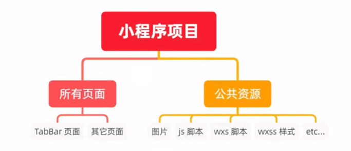
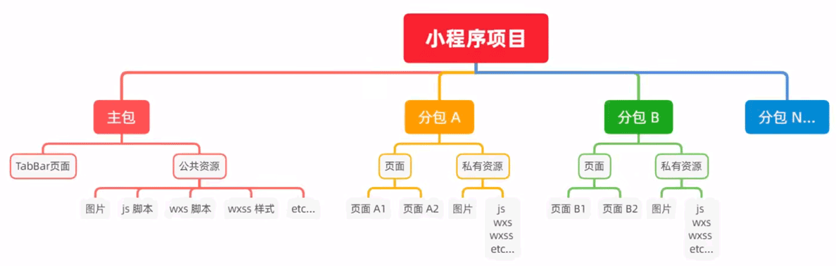
分包的项目:
- 组成:1个主包 + 多个分包
- 主包:启用页面(或 tabBar 页面) + 公共资源
- 分包:普通页面 + 私有资源
- 注意:公共资源,所有包都可以使用;私有资源,当前分包才可以使用。
分包的加载规则:
小程序启动时,默认会下载主包 并启动主包内的页面
- tabBar 页面需要放到主包中
当用户进入分包内的页面时,客户端才会下载分包并展示
- 非 tabBar 页面可以划分到分包中去,进行按需加载
分包的体积限制:
- 所有包(主包+分包)的总体积不超过 16MB
- 单个包(主包/分包)的体积不超过 2MB
# 4.2. 使用分包
目录:
proj/
  app.js
  app.json
  app.wxss

  pages/          # 主包页面
    home/
    message/
    my/

  shop/           # 分包
    pages/
      shop-list/
      shop-detail/

  product/        # 分包
    pages/
      product-list/
      product-detail/
配置:
// app.json

// 配置好后,按保存即可自动创建模板文件
{
  // 主包
  "pages": [
    "pages/home/home",
    "pages/message/message",
    "pages/my/my"
  ],

  // 分包
  "subpackages": [
    {
      "root": "shop",
      "pages": [
        "pages/shop-list/shop-list",
        "pages/shop-detail/shop-detail"
      ]
    },
    {
      "root": "product",
      "pages": [
        "pages/product-list/product-list",
        "pages/product-detail/product-detail"
      ]
    }
  ],
}
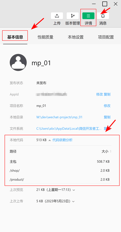
查看包体积:
分包原则:
- 分包:
[app.json].subpackages配置的目录 - 主包:subpackages 之外的目录
- 主包页面:
[app.json].pages - 注意:
- tabBar 页面必须在主包内
- 分包之间不能嵌套
引用原则:
- 分包内的私有资源:只有当前分包可以引用
- 主包内的公共资源:所有包都可以使用
# 4.3. 独立分包
说明:
普通分包
- 依赖主包(的资源)
- 当小程序从普通分包的页面启动时,需要先下载主包
独立分包
- 不依赖主包
- 可独立运行,提升分包页面的启动速度
- 可以有多个独立分包
- 只能引用自身的私有资源,无法访问 主包的公共资源、普通分包的私有资源
配置:
// app.json
{
  "subpackages": [
    // 普通分包
    {
      "root": "packageA",
      "pages": [ "pages/cat", "pages/dog" ]
    },

    // 独立分包
    {
      "independent": true, // 设置为独立分包

      "root": "packageB",
      "pages": [ "pages/apple", "pages/banana" ]
    }
  ]
}
# 4.4. 分包预下载
说明:
- 进入某个页面时,自动预下载指定的分包,从而提升页面启动速度
- 某个页面指定的 预下载分包 的总体积不能超过 2MB
配置:
{
  "pages": [
    "pages/home/home"
  ],

  "subpackages": [
    {
      "root": "shop",
      "pages": [
        "pages/shop-list/shop-list",
        "pages/shop-detail/shop-detail"
      ]
    },
    {
      "root": "product",
      "pages": [
        "pages/product-list/product-list",
        "pages/product-detail/product-detail"
      ]
    }
  ],

  "preloadRule": {
    // 当进入 home 页面后,进行预下载
    "pages/home/home": {
      // all: 不限网络
      // wifi: 默认值,仅 wifi 下预下载
      "network": "all",

      // 分包的 root 或 name 属性值
      "packages": ["shop", "product"]
    }
  }
}
# 5. 自定义 tabBar
说明:
- 更加灵活地设置 tabBar 样式
- 参考:miniprogram/dev/framework/ability/custom-tabbar.html (opens new window)
配置:
{
  "pages":[
    "pages/home/home",
    "pages/message/message",
    "pages/contact/contact"
  ],
  "tabBar": {
    "custom": true, // 指定为自定义 tabBar

    // list 配置要完整保留:1. 兼容旧版本;2. 标明哪些页面为 tabBar 页面
    "list": [
      {
        "pagePath": "pages/home/home",
        "text": "首页",
        "iconPath": "/images/home.png",
        "selectedIconPath": "/images/home-active.png"
      },
      // ...
    ]
  },
}
定义 tabBar 代码文件:
- 在项目根目录下创建
custom-tab-bar目录 - 在
custom-tab-bar目录上 右键菜单->新建 component,组件名称为 index
编写 tabBar 代码:
编写 index.wxml
使用 Vant Weapp:
// custom-tab-bar/index.js
Component({
  storeBindings: {
    fields: ['activeTabBarIndex'],
    actions: ['updateActiveTabBarIndex'],
  },
  data: {
    "list": [
      {
        "pagePath": "pages/home/home",
        "text": "首页",
        "iconPath": "/images/home.png",
        "selectedIconPath": "/images/home-active.png"
      },
      {
        "pagePath": "pages/message/message",
        "text": "消息",
        "iconPath": "/images/message.png",
        "selectedIconPath": "/images/message-active.png",

        /*
          // store.num --> info
          Component({
            storeBindings: {
              fields: ['num'],
            },

            observers: {
              'num': function(num) {
                this.setData({
                  'list[1].info': num,
                })
              }
            },
          });
        */
        info: 2,
      },
      {
        "pagePath": "pages/contact/contact",
        "text": "联系我们",
        "iconPath": "/images/contact.png",
        "selectedIconPath": "/images/contact-active.png"
      }
    ]
  },

  methods: {
    onChange(event) {
      const activeTabBarIndex = event.detail;
      this.updateActiveTabBarIndex(activeTabBarIndex);
    },
  }
})


// custom-tab-bar/index.wxml
<van-tabbar
  active="{{ activeTabBarIndex }}"
  bind:change="onChange"
  active-color="#29476E"
>
  <van-tabbar-item
    wx:for="{{ list }}"
    wx:key="index"
    info="{{ item.info || ''  }}"
    url="{{ item.pagePath }}"
    link-type="switchTab"
  >
    <image
      slot="icon"
      src="{{ item.iconPath }}"
      mode="aspectFit"
      style="width: 30px; height: 18px;"
    />
    <image
      slot="icon-active"
      src="{{ item.selectedIconPath }}"
      mode="aspectFit"
      style="width: 30px; height: 18px;"
    />
    {{ item.text }}
  </van-tabbar-item>
</van-tabbar>
修改 van-tabbar 组件样式:
custom-tab-bar/index.js:
// custom-tab-bar/index.js
Component({
  options: {
    styleIsolation: 'shared',
  },
  // ...
})
custom-tab-bar/index.wxss:
/* custom-tab-bar/index.wxss */
.van-tabbar-item {
  --tabbar-item-margin-bottom: 0;
}
上一篇: 下一篇: